
- one page per date (ex: mother),
- one page per couple of dates (ex: mother - father),
- and one page with an overview of the distributions, called the gallery.
Abbreviations
| Planet | Sun | Moon | Mercury | Venus | Mars | Jupiter | Saturn | Uranus | Neptune | Pluto |
|---|---|---|---|---|---|---|---|---|---|---|
| Code | SO | MO | ME | VE | MA | JU | SA | UR | NE | PL |
Table of contents
In the table of contents, the colored articles signal a distribution showing a significant anomaly (with p-value < 0.05).For example, in the death in France study:
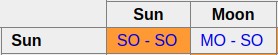 Indicates that the distribution
 SO-SO (relation between sun and sun) shows a statistically significant anomaly, but the distribution MO-SO (relation between moon and sun) does not.
Here, "statistically significant anomaly" means a p-value below 0.05, computed from one-dimensional arrays (using control groups), not from two-dimensional arrays (using average method).
Bar graph / curve
 This kind of image permits to visualize on the same drawing observed and expected distributions.
- The bar in grey represent the observed distribution.
- The curve in black represents the expected distribution, computed from control groups.
On the y axis, the numbers indicate the minimal, mean and maximal values.
Age
"Age between date1 and date2" represents date2 - date1 = the time needed to go from date1 to date2. So "Age between child and wedding" means the time needed to go from wedding date to child birth.
It's negative because in general people get married before having a child.
Table
Table view is inspired by an article of Didier Castille, "A Link between Birth and Death" ("Un Lien entre la Naissance et le Décès").In this example, each horizontal line concerns a position of mars at birth, and a vertical line represents a position of mars at death.
For example, the cell at the intesection of horizontal line 120° and vertical line 100° concerns the persons born with mars at 120° and deceased with mars at 100°.
Tables give a more detailed view than bar graph / curve view:
In the mars at birth / mars at death example, the bar graph / curve representation shows a strong excess at 0°.
In the table view, this excess is visible through the diagonal line in red.
Theoretical values are computed with the method described by Didier Castille (and Wikipedia).
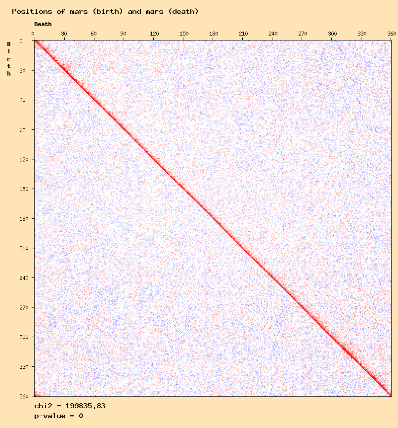
The colors represent the excess or deficit compared with the theoretical expected value, in percentage.
Current settings are:
| Observed value above +45 % of the expected value | |
| Observed value between +40 % and +45 % of the expected value | |
| Observed value between +35 % and +40 % of the expected value | |
| Observed value between +30 % and +35 % of the expected value | |
| Observed value between +25 % and +30 % of the expected value | |
| Observed value between +20 % and +25 % of the expected value | |
| Observed value between +15 % and +20 % of the expected value | |
| Observed value between +10 % and +15 % of the expected value | |
| Observed value between +5 % and +10 % of the expected value | |
| Observed value between -5 % and +5 % of the expected value | |
| Observed value between -10 % and -5 % of the expected value | |
| Observed value between -15 % and -10 % of the expected value | |
| Observed value between -20 % and -15 % of the expected value | |
| Observed value between -25 % and -20 % of the expected value | |
| Observed value between -30 % and -25 % of the expected value | |
| Observed value between -35 % and -30 % of the expected value | |
| Observed value between -40 % and -35 % of the expected value | |
| Observed value between -45 % and -40 % of the expected value | |
| Observed value below -45 % of the expected value |